You guys. It’s finally here. Alive, in it’s flesh, for the whole world to see (okay, maybe the 10 of you that actually read this thing and my mom). I HAVE AN ACTUAL PORTFOLIO SITE for the first time since I’ve started this crazy business. And it’s loaded with not only weddings & engagements, but commercial work, lifestyle work, portraits, travel, etc.
I’m also so excited to reveal my new branding! A lot of blood, sweat, and tears went into this thing over the last year when I originally started this whole crazy idea of “hey, I can totally do this myself!”. And of course, as the months moved on, I procrastinated more and more. That’s the funny thing about branding yourself — you can take your sweet ass time because you’re not running up a bill. And that’s the most awful part….I have a million chances to change something and second guess myself. Well, it ends now. Clean, simple, bright, but considered. I’m happy, proud, and think this is the truest reflection of allowing my photography work to shine.
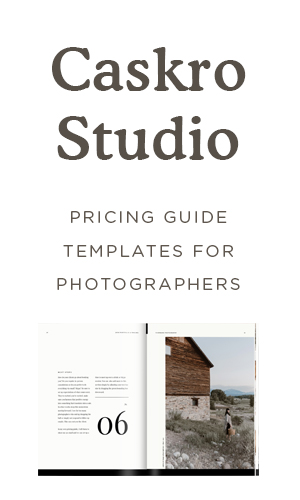
A new website, a new blog, business cards, thank you cards, envelopes, zip drives, packaging and custom wrapping paper. There’s also a slew of behind the scenes things like a custom contract, questionnaire, client pdfs, welcome booklet & pricing guide (which you can see pulled up on the iPad at the end). Whew. I don’t think I’ll be taking on another one of these bad boys for a loooooong time. Throughout the post, I’ll point out all vendors involved in case you’re interested.
Here it is in all it’s glory — the new Carina Skrobecki Photography. So go, wander around & explore. Hope y’all like it! .jpg)
.jpg) My business cards were printed through the Pike Street Press by my buddy Sean — 220# Crane Lettra with a deep blue and a copper edge painting. Love the way they turned out!
My business cards were printed through the Pike Street Press by my buddy Sean — 220# Crane Lettra with a deep blue and a copper edge painting. Love the way they turned out! .jpg)
.jpg) This lovely little welcome booklet was printed through MagCloud. So cheap and easy to design & upload. I opted for a perfect-bound book — it’s loaded with information for new clients including what working with me looks like, info about their shoots, sample images, tips for arranging your wedding day based on lighting, etc. More on this to come…
This lovely little welcome booklet was printed through MagCloud. So cheap and easy to design & upload. I opted for a perfect-bound book — it’s loaded with information for new clients including what working with me looks like, info about their shoots, sample images, tips for arranging your wedding day based on lighting, etc. More on this to come… .jpg)
Custom wooden thumb drives are via Green Thumb Drives — they’re great because you can literally brand them any way you want, choose any size & wood type. Easy & reasonably priced. Also, the kraft button-string envelopes are from a great Japanese stationer, Midori. There are a few US outlets that carry them — I found one in San Francisco and ordered up every single envelope they carried I loved them so much. .jpg)
.jpg) I ordered plain white, matte boxes from Wildcat Wholesale and use a simple heather gray tissue to package up a thank you card in an envelope, a few prints wrapped in copper thread, a business card, & a thumb drive of the final edited photos. I had custom wrapping paper made through Spoon Flower — not the cheapest (at about $15/roll) but so easy to order and a great quality. I painted this tiny dot pattern then uploaded in into a seamless pattern, ordered a few rolls and I think it makes a great impact in the mail.
I ordered plain white, matte boxes from Wildcat Wholesale and use a simple heather gray tissue to package up a thank you card in an envelope, a few prints wrapped in copper thread, a business card, & a thumb drive of the final edited photos. I had custom wrapping paper made through Spoon Flower — not the cheapest (at about $15/roll) but so easy to order and a great quality. I painted this tiny dot pattern then uploaded in into a seamless pattern, ordered a few rolls and I think it makes a great impact in the mail. .jpg) Lastly, my thank you cards were also printed on Crane Lettra — 110# with a copper foil, done by the one and only Nikko Media.
Lastly, my thank you cards were also printed on Crane Lettra — 110# with a copper foil, done by the one and only Nikko Media. .jpg)
.jpg)
.jpg)
.jpg)
.png)
.png) Lastly my site. My long awaited actual portfolio site. It was a customized WordPress template done by the extremely talented Sean Thompson, who is just the jack of all trades. A huge thank you to him for his time & effort into making this site exactly what I wanted. Remember this guy…oh from like a year ago? Here is how this moodboard translated into my new look/feel.
Lastly my site. My long awaited actual portfolio site. It was a customized WordPress template done by the extremely talented Sean Thompson, who is just the jack of all trades. A huge thank you to him for his time & effort into making this site exactly what I wanted. Remember this guy…oh from like a year ago? Here is how this moodboard translated into my new look/feel. .jpg)


Carina! First off, I want you to know that I am one of the more than 10 people who reads your blog – every single post. You’re one of my favorites in the industry, and such an inspiration in everything you do. The new branding is gorgeous. Personal, clean, artistic – I just love it. Love, love, love it. You killed it, girl!
PS – slightly obsessed with the dots. Slightly. :)
Carina, you’ve done an amazing job. It is so hard designing for yourself – I completely understand having done it myself. I absolutely love all your packaging – the custom wrapping paper is fab – I want some! I really love how the galleries work on your website, simple and clean works so well and really showcases your stunning images.
p.s. I regularly read your blog, so definitely more than 10 of us out there! :)
It is B-E-A-U-T-I-F-U-L! Congrats girl, so happy for you and this lovely little site. You rock.
Love your new branding! I have a total weak spot for crane lettra 220 #. Swoon! I am also digging the custom wrapping paper – do you think their material would make good envelope liners?